Test Steps
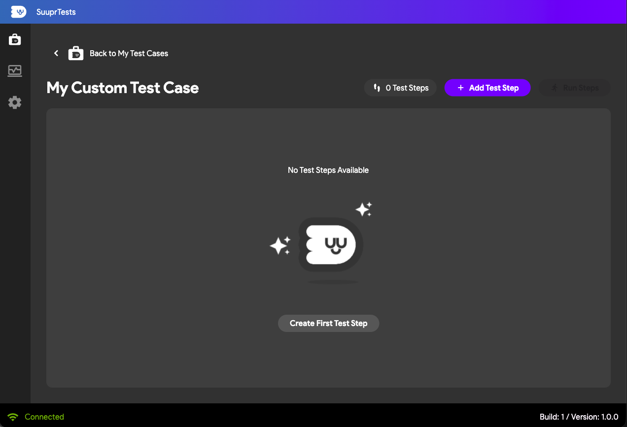
A Test Case in SuuprTests is composed of individual Test Steps. Each step represents a distinct action or validation performed by the framework against your Flutter app—just like an authentic user navigating your UI!
Adding Test Steps
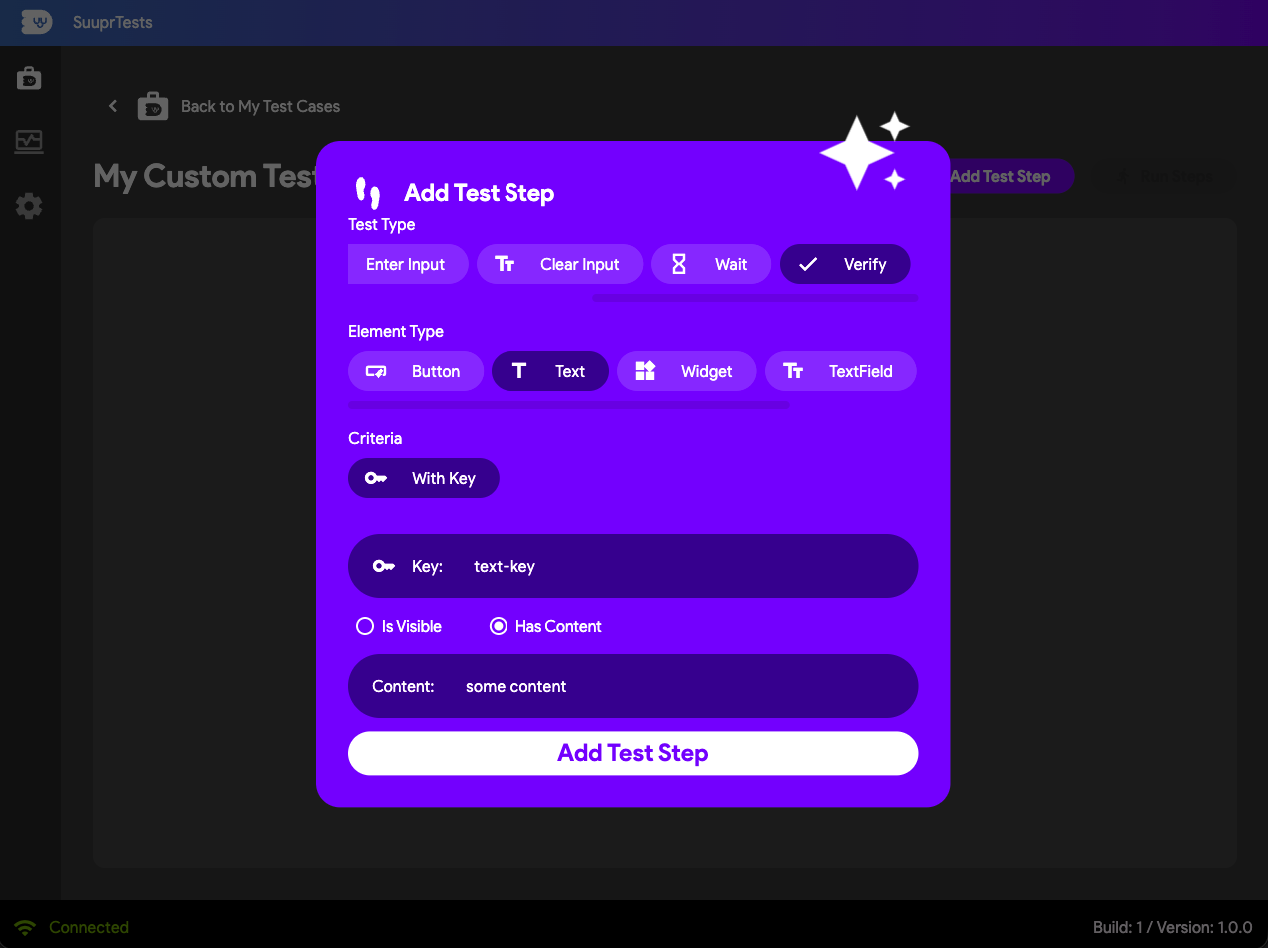
Once you've created a Test Case, you can begin adding sequential Steps to completely define your flow.
- Open your desired Test Case in the SuuprTests admin.
- Click the Add Step button to insert a new event to the end of the test explicitly.
- Configure the Target Action, Element Type, and corresponding criteria.
Test Step Options
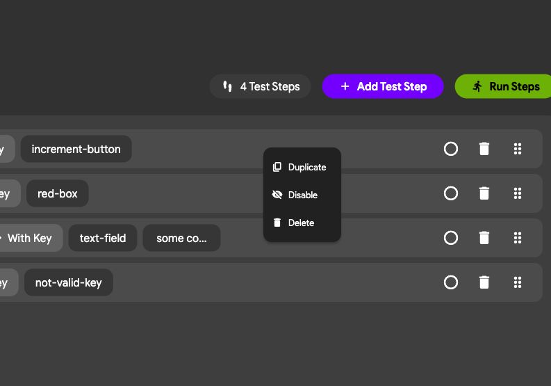
Each individual test step in your sequence has contextual options and settings you can modify directly to fine-tune your workflow. Simply select a step or click its options menu to reveal them.
Current options are:
- Duplicate Test Step: duplicates the test step with the same configuration.
- Disable Test Step: hides the test from being executed in the test case run.
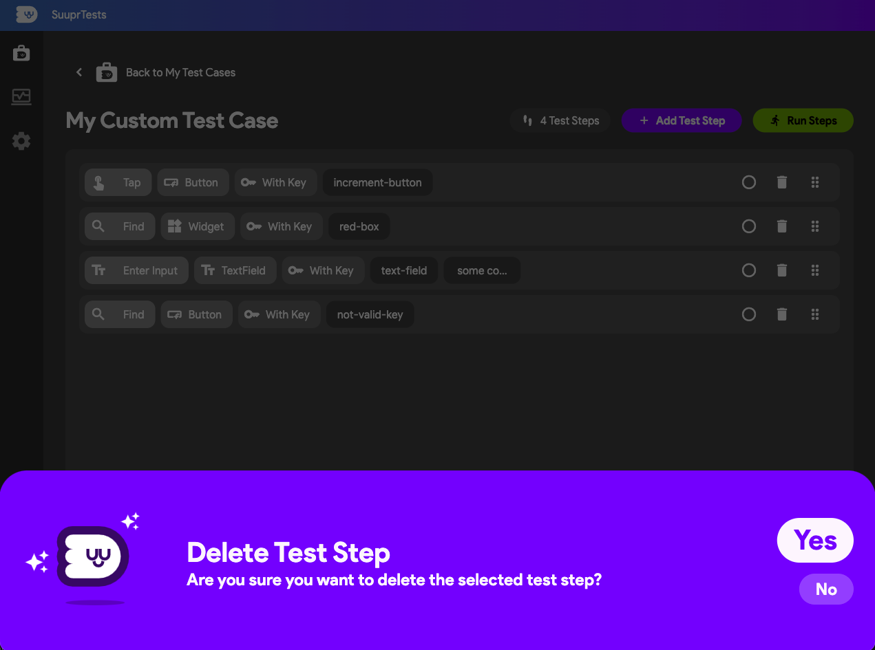
- Delete Test Step: removes the test from the test case. Same as clicking on the trash can icon next to the test step.
Reorder Test Steps
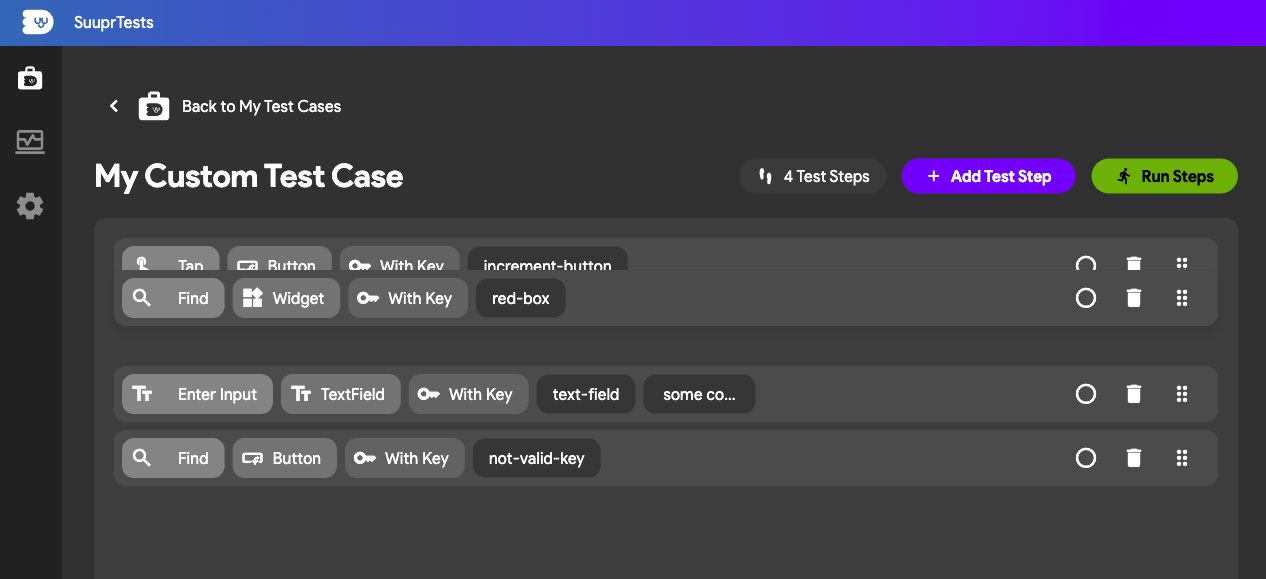
Test case execution in SuuprTests is continuously executed sequentially top-to-bottom. If you need to fix your automated script or adjust the flow, you can dynamically drag and drop your steps to reorder them without having to delete and recreate them from scratch.
Deleting a Test Step
If an action within your test is no longer relevant due to a Flutter app behavior change, you can quickly dump it from the sequence by selecting its dedicated delete icon.
We don't support editing a test step at the moment. Since they are easy to create, we recomment creating a new test step and deleting the old one.
Anatomy of a Step
Each step requires you to define what action is being performed and which element you are targeting.
Step Types (Actions)
- Find: Explicitly wait and locate a widget on the screen without interacting with it.
- Tap: Simulate a touch/click event on a specific element or coordinate.
- Scroll: Simulate a swipe/scroll gesture on scrollable areas.
- Enter Input: Simulate typing text on the device's keyboard into input fields.
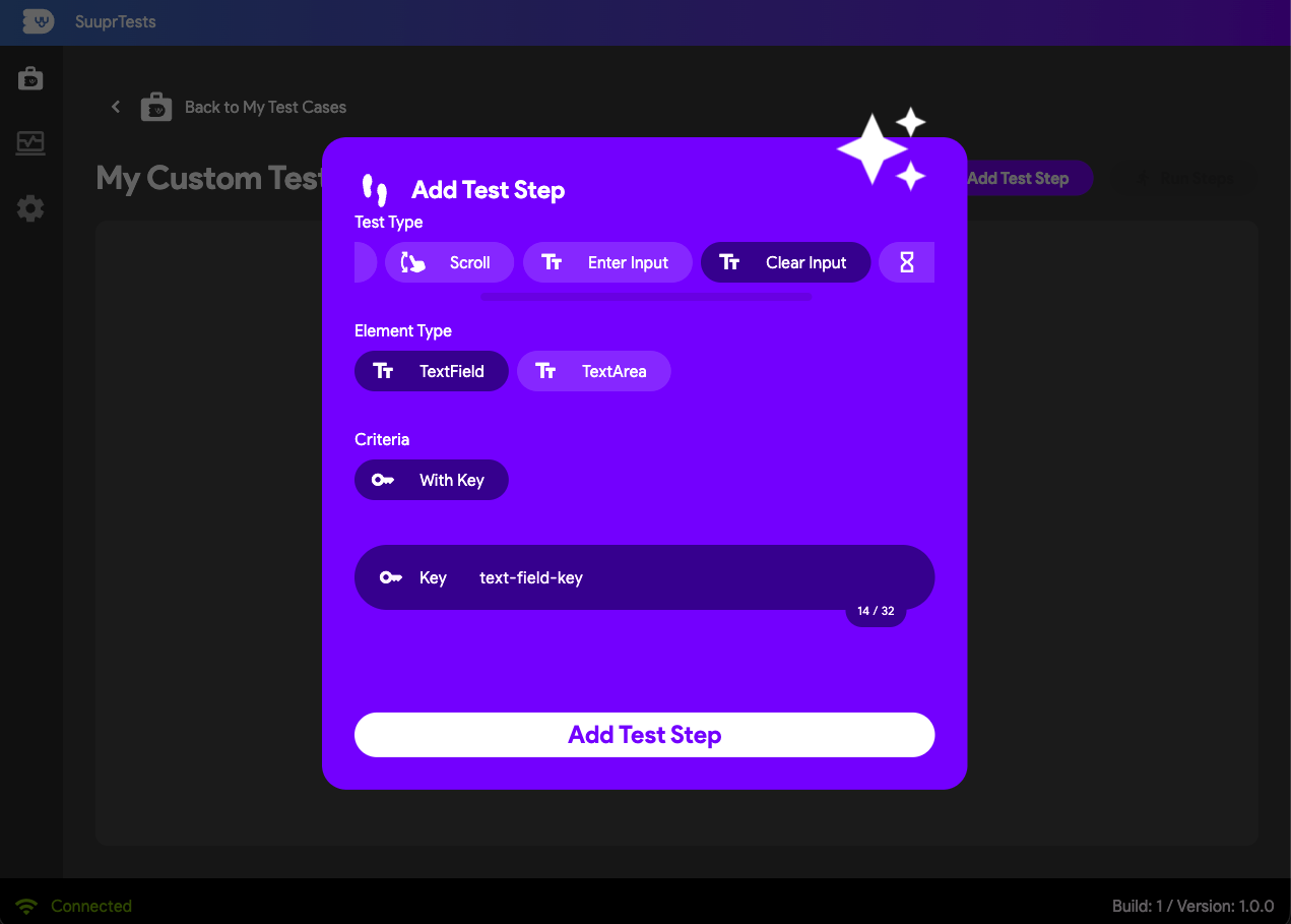
- Clear Input: Clear the text from an input field.
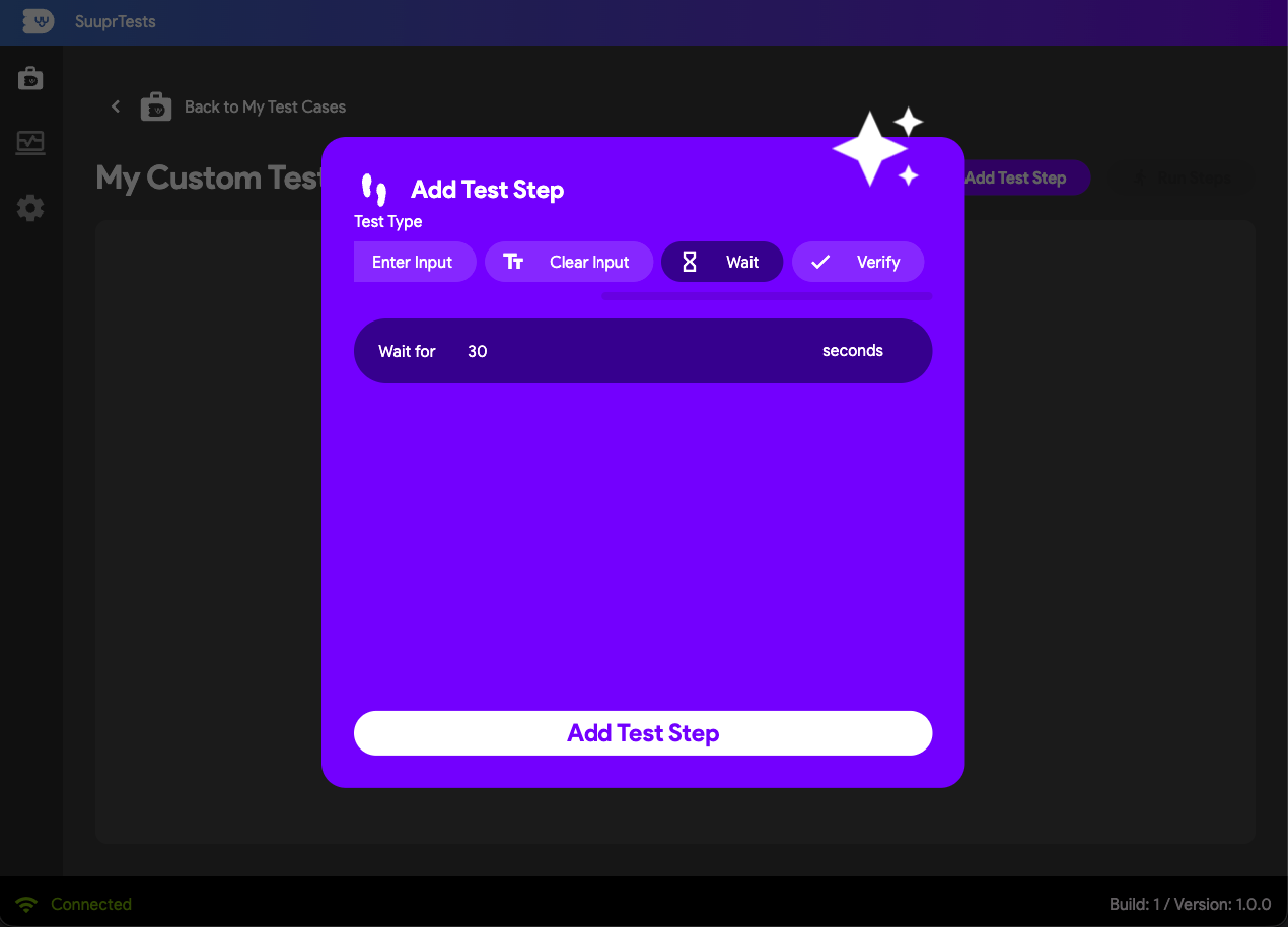
- Wait: Pause test execution unconditionally.
- Verify: Assert that a condition is true (e.g., an element is visible or contains certain text).
Element Types
To execute an action, you must also define the Element Type. Depending on the selected test action above, SuuprTests populates the available element types you can use to target your app's widgets:
- Button: Any clickable widget (ElevatedButton, TextButton, IconButton, etc.).
- Label / Text: Static text presentation widgets.
- TextField / TextArea: Form or search input elements.
- Widget: A generic fallback for custom widgets (usually found via its
Key). - Location: Specific X and Y coordinates on the rendering screen.
- Scrollable Widgets: Any scrollable widget (ListView, GridView, SingleChildScrollView, Table, etc.).
Criteria
- See below for the multiple criteria available for each element type.
Find Test Steps
The Find Test Step type is essential for ensuring your app has finished rendering before proceeding to interact.
- Find Button with Key: Locates a button explicitly using its assigned unique
Key.
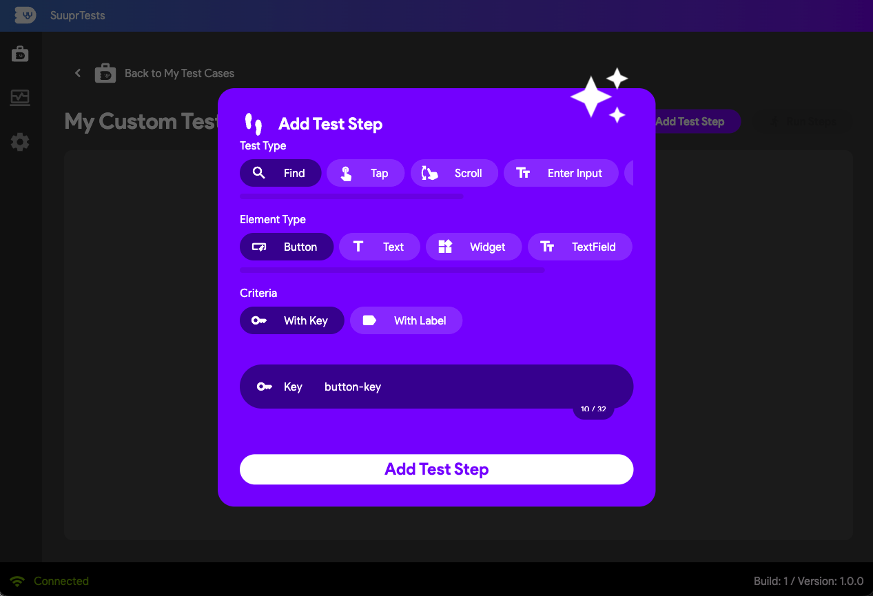
- Find Button with Label: Locates a button natively by parsing its visible text label.
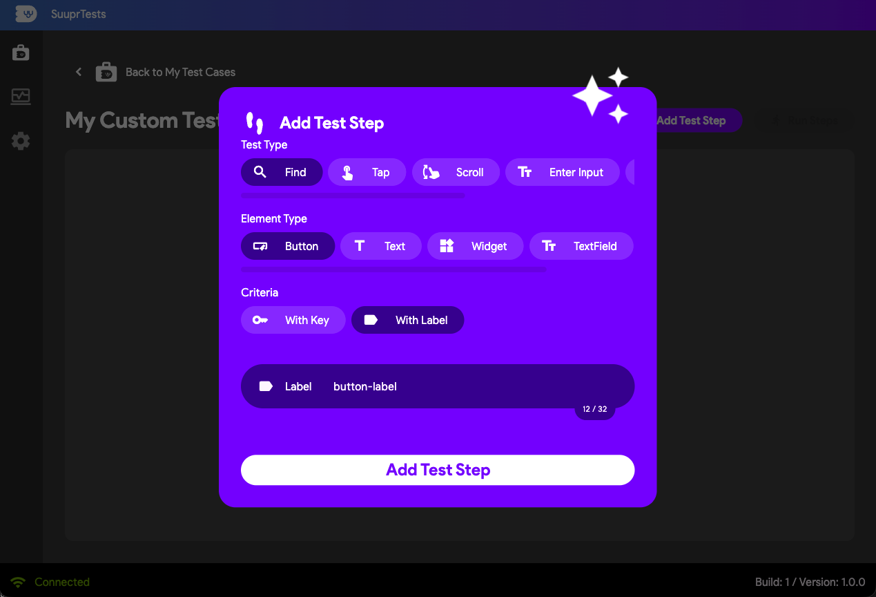
- Find Text Area with Key: Locates a multi-line text input field using its unique key.
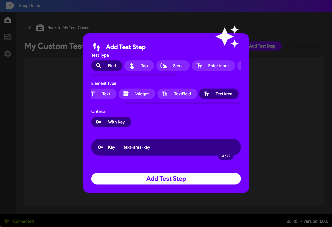
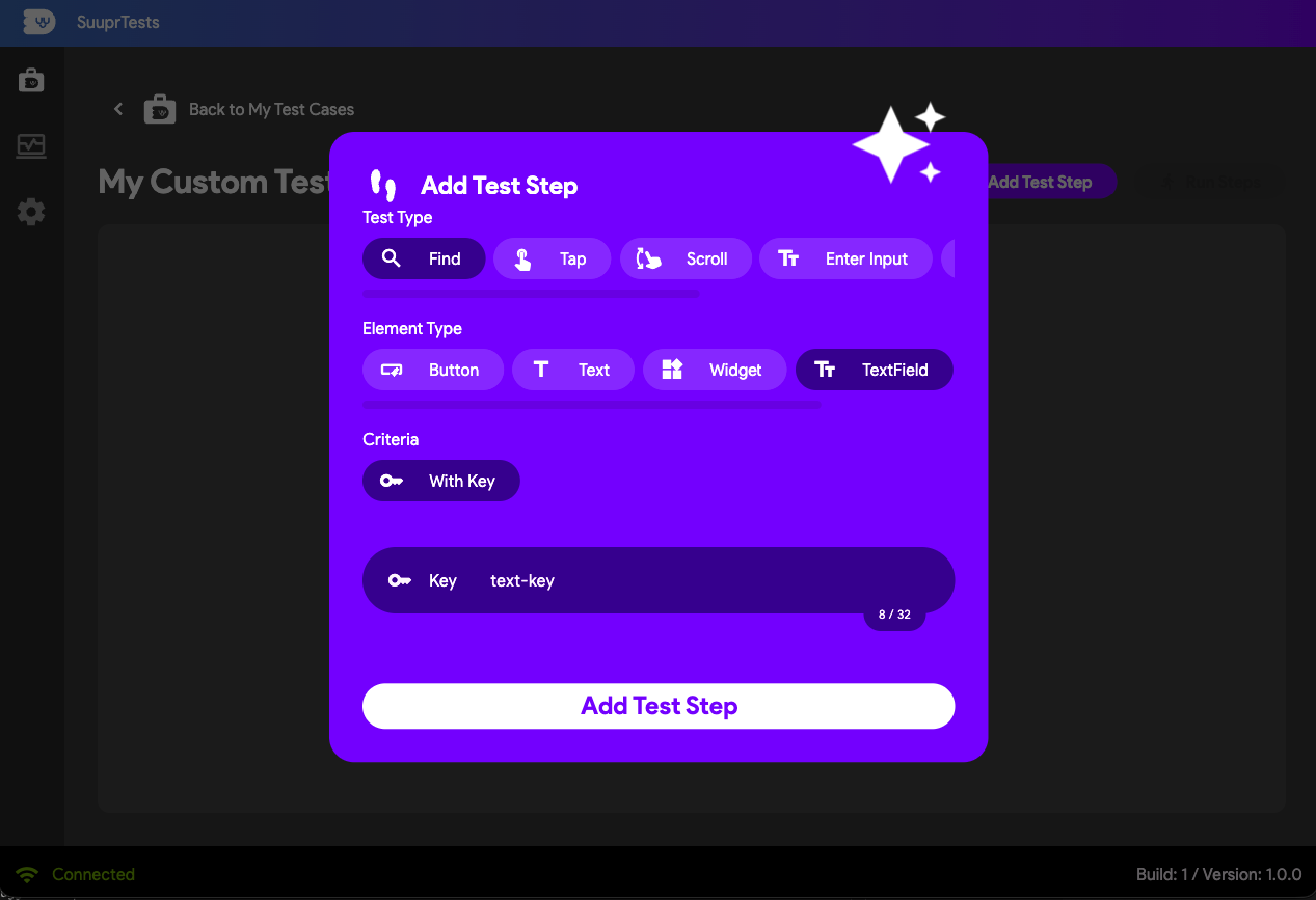
- Find TextField with Key: Locates a standard single-line input field using its unique key.
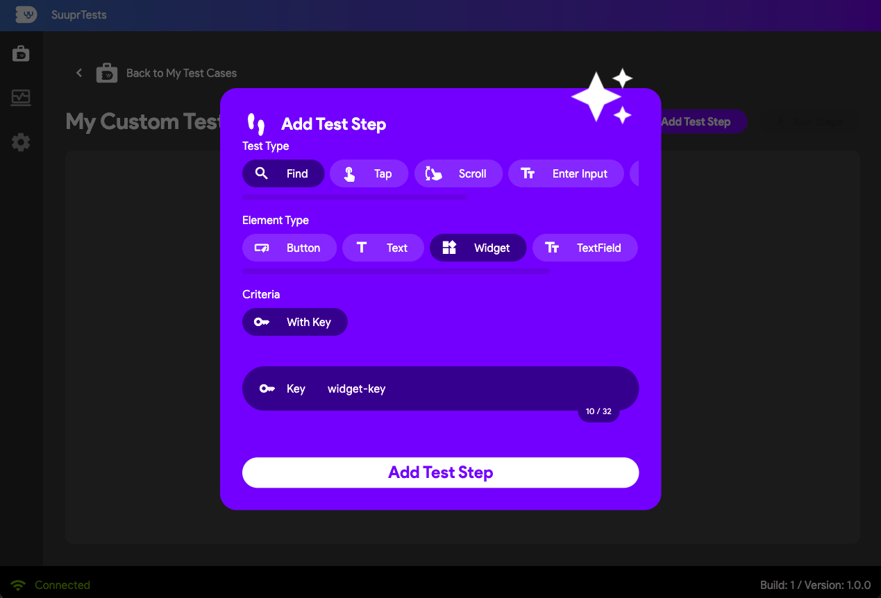
- Find Widget with Key: Locates any arbitrary custom widget block by its key.
Tap Action Test Steps
Simulate user touch events directly on targeted interactive widgets or raw screen locations.
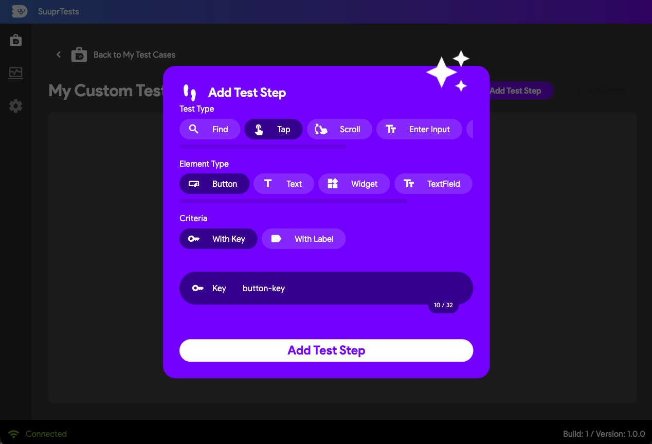
- Tap Button with Key:
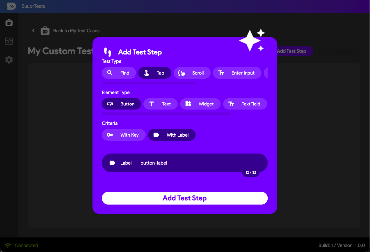
- Tap Button with Label:
- Tap TextField with Key:
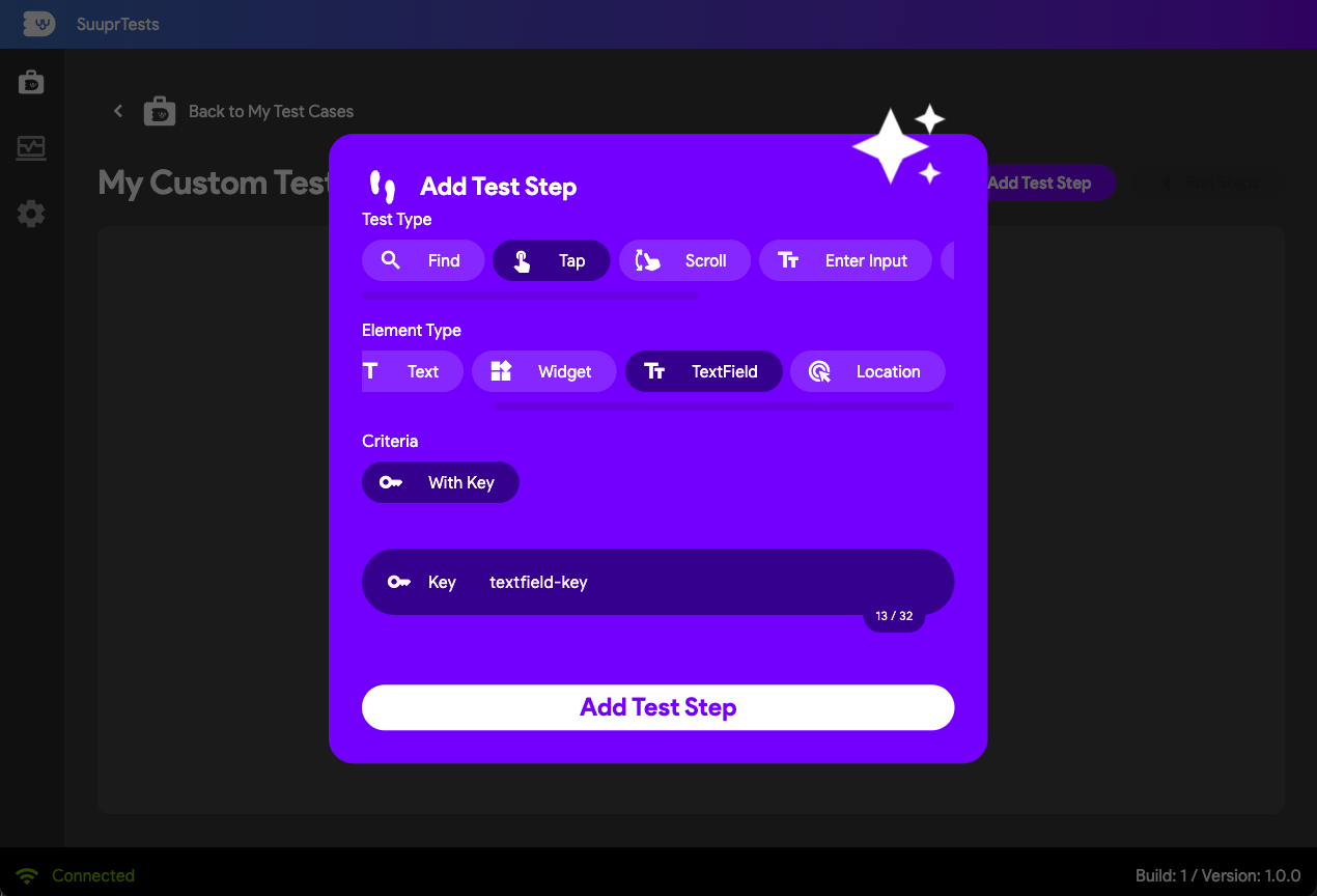
- Tap Text with Key:
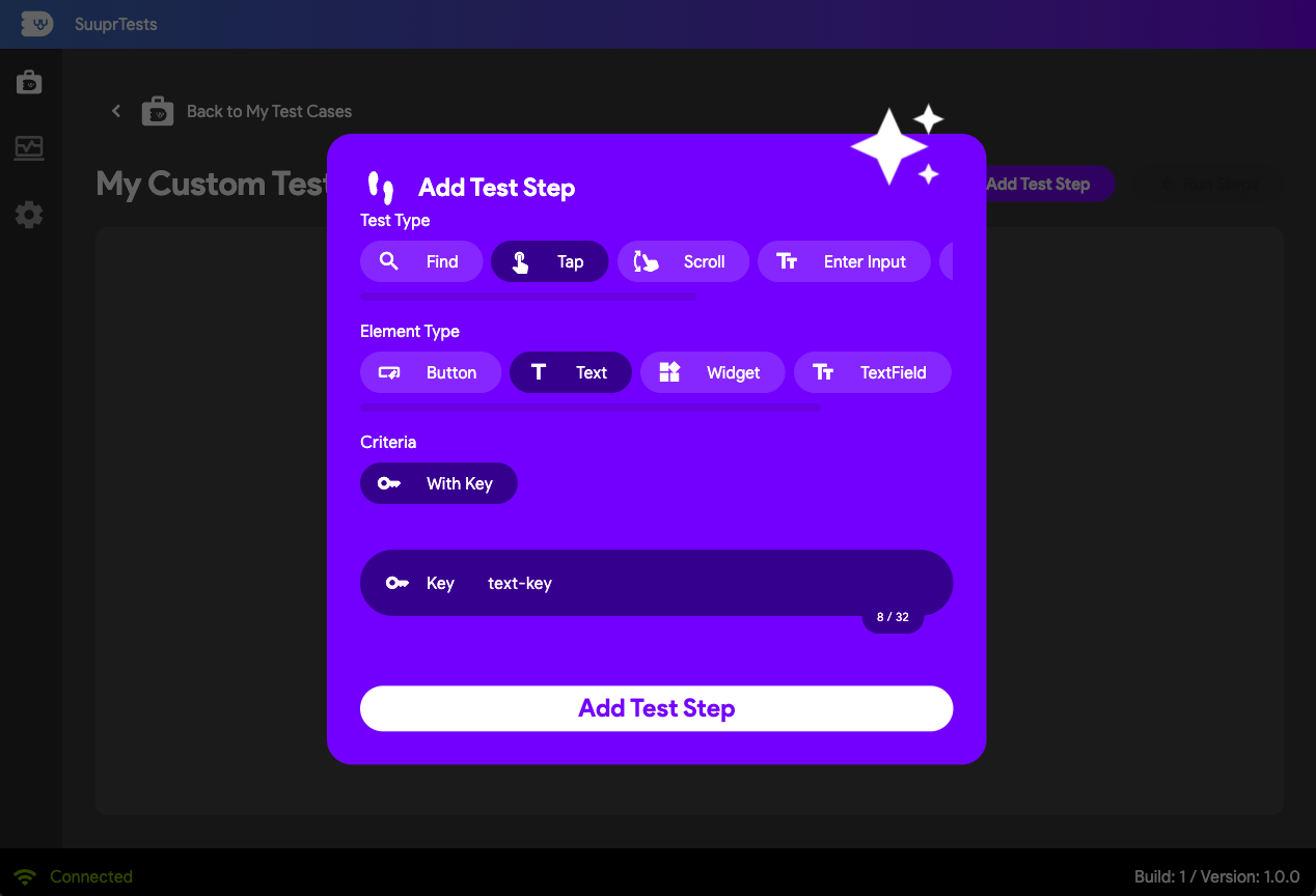
- Tap Widget with Key:
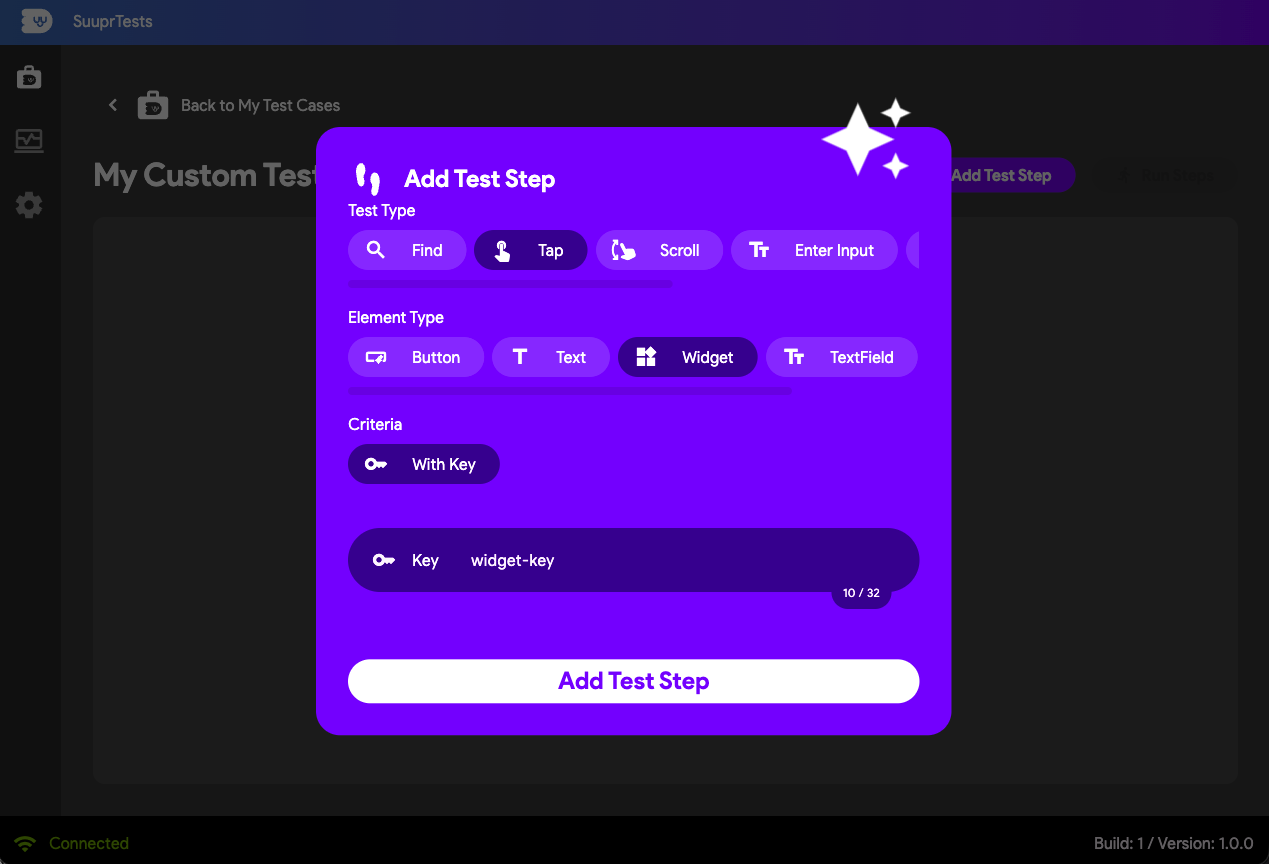
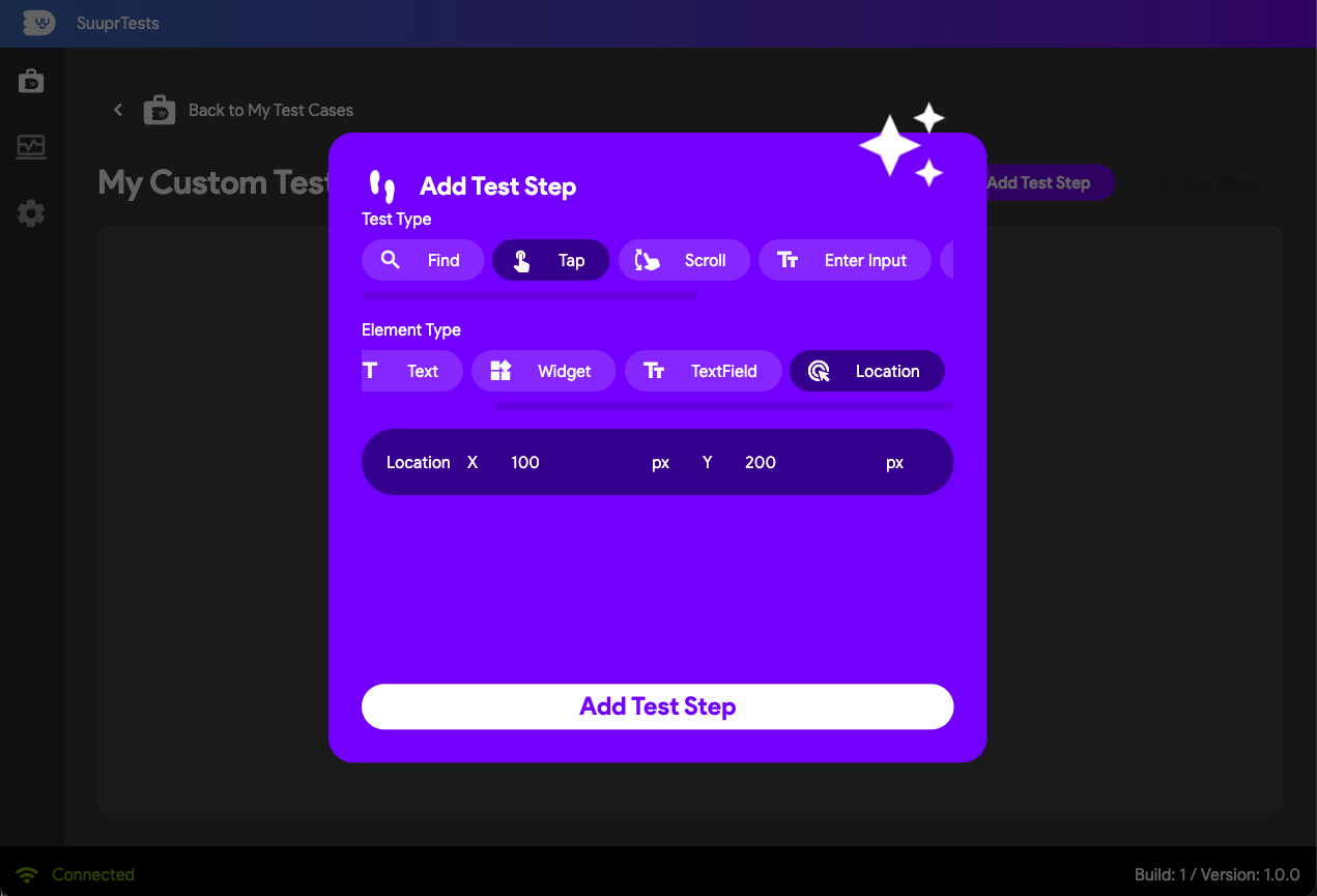
- Tap Location (X/Y): Taps a specific pixel coordinate on the device screen unconditionally instead of mapping through the widget layout tree, using the x/y coordinates of the screen absolutely, where (0,0) is the top-left corner of the screen.
Scroll Action Test Steps
Navigate seamlessly through dynamic lists, grids, and long forms by simulating dragging gestures.
- Scroll View: Target generic listviews, gridviews, tables, or strictly scrollable widgets.
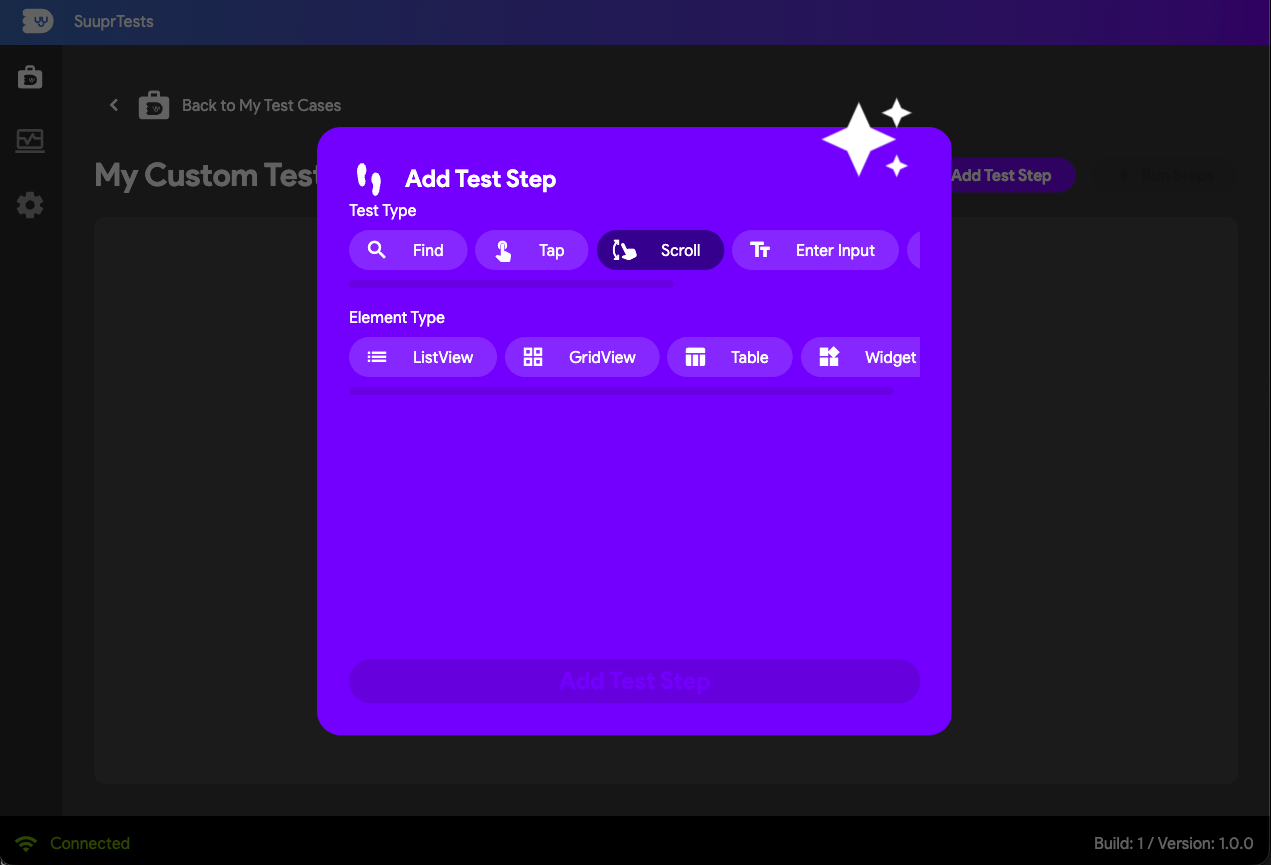
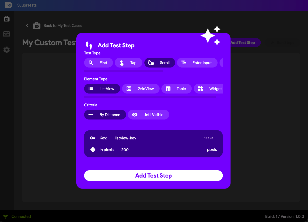
- Scroll ListView by Distance: Programmatically scroll a specific number of pixels vertically or horizontally along the axis.
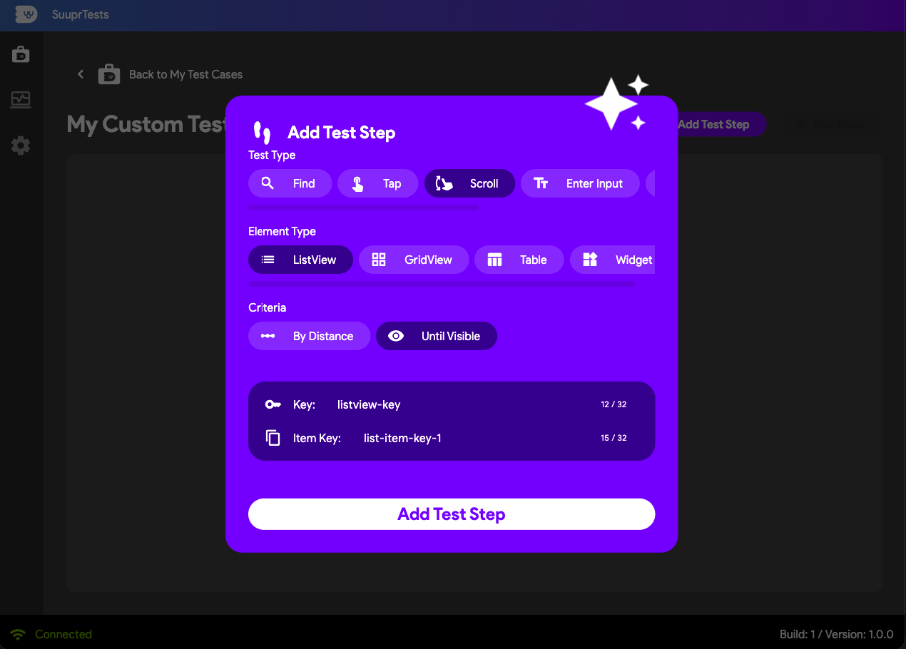
- Scroll Until Visible: Continually scroll along a designated area until a specific target widget surfaces onto the screen.
Input Action Test Steps
Automate form filling, sign-in screens, and device keyboard interactions.
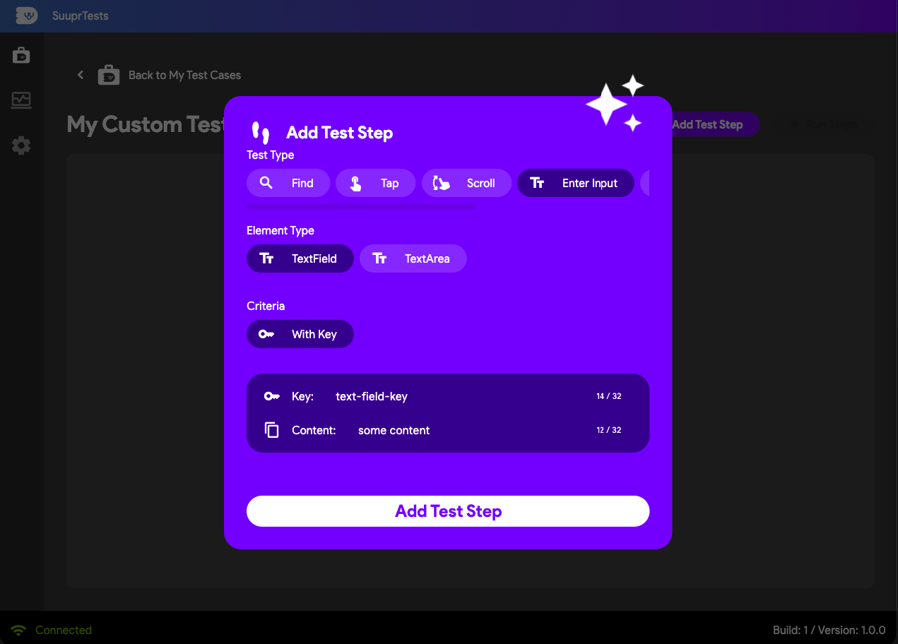
- Enter Input: Target a TextField or TextArea using its
Key, and provide the textual content payload you want the test runner to type securely.
- Clear Input with Key: Instantly wipe all existing text from a targeted input field using its explicit
Keybefore entering new assertions.
Wait Action Test Steps
Sometimes complex rendering animations, heavy network calls, or asynchronous transitions need explicit hard-coded buffer time.
- Wait for X Seconds: Pauses the test runner executor loop completely for a specified duration before executing the succeeding step.
Verify Action Test Steps
Verify steps act as your test assertions, explicitly dictating whether your app passed the behavior check. If a VERIFY step fails in testing, your entire test case is flagged as failed.
- Is Visible: Validates that a targeted widget (identified securely via a Key or Label string) exists and is successfully painted onto the screen geometry.
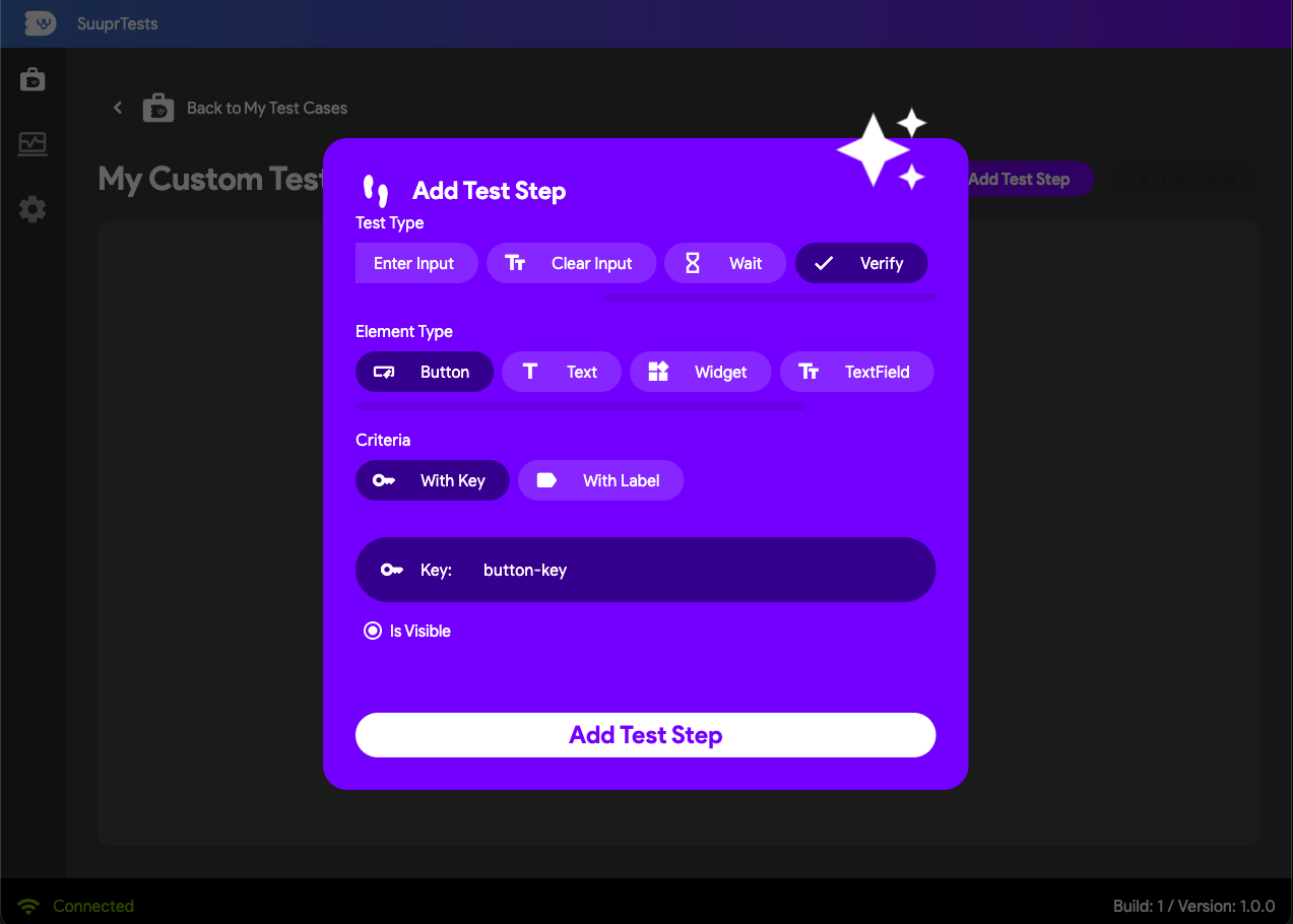
- Has Content: Validates that a specific dynamic widget (like a Text label or TextField referenced by its Key) exactly matches or holds the expected payload string content.